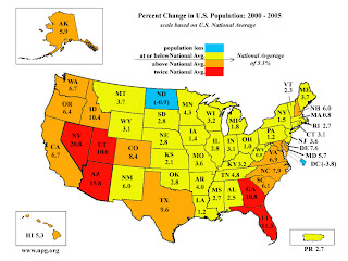
This map shows a lot of information in an uncluttered format. There is a title explaining what the map contains and a legend. The colors progress from blue for negative population change to red for highly positive population change. This is intuitive for rates at the opposite ends of the spectrum. The map is uncluttered and the rate of change data are categorized sensibly. No north arrow is needed as direction is easily assumed.

This is also a good example..once we get into data and the appropriate color scheme you will find that there may have been a better color option for this type of data.
ReplyDelete