Sunday, August 2, 2009

Post/Pre Sand Volume map


This map shows the shore configuration using a comparison of the pre storm coast subtracted from the post storm coast to show the change in sand volume using the Spatial Analyst raster calculator. The map is more detailed then the Cut/Fill map but the tendencies are the same in both maps. The hurricane moved large amounts of sand from the near shore area up the beach due to storm surge and wave action.

Cut/Fill Raster Image


The Cut/Fill tool in Spatial Analyst shows how Hurricane Ivan changed the configuration of the shoreline. It is apparent that the storm surge pulled large volumes of sand from the near shore area and deposited the sand further up on the beach.

Pre-Hurricane DEM


This LIDAR image of the Gulf Shores area is before Hurricane Ivan struck. My sand volume is 5 percent higher than it would have been if I was able to use the extract tool in Spatial Analyst to crop the image to the size of the shapefile. The software returned an error code 99999 which was a generic error. Further investigation would have been to look at the log file but time was too short so after a few tries such as reboot, reloading of data and changing load order the decision was made to complete the lab as is.

Wednesday, July 29, 2009

Pensacola, Florida Supervised Classification Map


This map was classified and recoded with ERDAS 9.3 using the supervised method. At least 3 training sites were picked for each land use category. Overall, it appears to be more accurate and shows the mix of residential and trees in a close up view. There are still some problems do to the pixel colors of urban and offshore currents being the same thus all being classified as urban. Also, as in the unsupervised map parts of the airport runway are either classified as urban because of the concrete or agriculture because of the color match with the farming areas. Maybe some post-processing editing would be necessary to correct these issues. There may be other tools in ERDAS that could fix the problems too or maybe more training areas would have corrected some of the issues.

Thursday, July 23, 2009

Pensacola Recoded Classification Map


The above satellite image was classified and then recoded using ERDAS 9.3. The ISODATA algorithm was used with 15 classes to be identified. From this the recode process narrowed the number of classes to 8 by combining similar classes.
Although the image roughly portrays the land characteristics on the real ground there are issues. Agricultural areas had roughly the same color as the airport runways so both were identified in the same class. Also, trees look the same whether in an urban or forest area and tree canopies tend to overwhelm parts of the urban area especially in a geographic area with prolific plant growth such as Pensacola, Florida.
These are typical problems in an unsupervised classification. One potential fix would have been to use more classes and a better color scheme to identify the different land use areas. This is primarily true for the vegetation aqnd urban areas that were difficult to differentiate from one another.


Tuesday, July 21, 2009

Image Rectification

Image rectification in GIS is the process of taking raw raster aerial photographs and transforming them into a chosen geographic coordinate system. This process is useful for cleaning up the raw raster photos and removing the distortion created during image acquisition. This distortion is caused by lens distortion, earth curvature, terrain and sensor orientation among others. A successfully rectified image will have more map like characteristics like a flat paper map. Also, if several images of the same area are rectified to the same coordinate system then "time-series" studies can be performed. If a region of photos is rectified then a mosaic can be created orientating all the images so as to create a larger area.
Drawbacks of image rectification would include; time to preprocess the map and then resample, lack of identifiable ground control points(GCP), error when choosing GCP's, image distortion and poor quality of an image that makes it difficult to identify GCP's.

Thursday, July 9, 2009

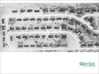
Thermal Image


The roads, sidewalks and patios are lighter in color because they are warmer in comparison to the vegetation and other above ground features. This is because concrete on the ground holds heat more efficiently then things above ground or vegetation and this becomes apparent in thermal images taken just before dawn.

Vegetation is generally darker at night because evapotranspiration allows these items to cool at night. The variety of shades is probably because different vegetation has varying moisture content which impacts heat retention.

Storage sheds and autos are dark meaning they are cooler than the surrounding ground. Items above ground with no heat source cool quickly at night and before dawn they are the coldest they will get. Some autos have a white spot in the front indicating the hot engine of autos moved just before the image was taken.

The bright spots on the roofs of the houses are from exhaust of the heating systems. The image was taken in winter at dawn which is the coldest time of the year and the day. In summer it may have been possible to see white spots near the houses on the ground do to the AC units as they expel warm air too.

Monday, July 6, 2009

Question7 Panchromatic and Multispectral Images


Question 7


The SPOT multi-spectral false color image at the top of the page shows vegetation in red. Vegetation jumps out on the image when compared to the panchromatic image below in gray scale.
The SPOT panchromatic image appears clearer and more in focus and the white areas (sand, roads and buildings) really are contrasted compared with the darker vegetation and water areas. Also, the below ocean surfaces show greater detail.
I think the panchromatic image may be more suitable when measuring beach erosion after a storm or longshore flow given the way the sand jumps out on the image. Also, man made structures such as roads appear clearer in the panchromatic image. The multi-spectral color image appears well suited for vegetation studies both on land and possibly at the ocean surface (algae blooms, plankton etc...).

Digital Orthophoto Quadrangles

Digital Orthophoto Quadrangles (DOQ) have many positives
but there are a few negatives in using them. They include:
a small area of coverage and a straight down perspective which shows no relief or the ability to perceive depth.
DOQ's generally are used as base maps and need other layers to get much usable data.
Also, DOQ's are current only when made and my guess is they would be outdated quickly unless a new aerial photo is scanned and processed.

Monday, April 27, 2009

Wind Farm Potential Site


This site lies on the eastern shore of Lake Michigan which has nearly constant high winds year round(NREL) which is the primary factor when locating a wind farm.
The area lies to the north of Little Sable Lighthouse which along with Big Sable Lighthouse to the north of the site have had verifiable wind gauge measurements for several years.
BERR planning criteria are met by the following:
1. Wind speed is well above that necessary for wind turbines.
2. Ornithology is debatable regardless although birds are common in the area.
3. Noise is not an issue as the area is sparsely populated.
4. Shadow flicker not an issue as the area is sparsely populated.
5.Shipping impact would not matter as the site is not near a shipping lane.
6. Visual impact could be an issue except the area lies north of Silver Springs State Park and presumably people would not likely visit the site. Also it is not near many roads but is in an agricultural area where many turbines are commonly located.
I have personally verified high winds on several visits to the area.

Thursday, April 23, 2009

Georgia Rainfall Isohyet Map


This map portrays Georgia annual rainfall using isohyets. They are in 5 inch annual rainfall intervals. The map was done in Adobe Illustrator freehand.

Sunday, April 19, 2009

Immigration Flow Map


Well, here is a try at a flow map. Never fully got the hang of the curved line thing but gave it an attempt anyway. North America was an issue as it splits between Canada and Mexico/Central America. The two arrows combine to make the width of the 339K North American immigration total. Most being from Mexico/Central America.
Adobe Illustrator can be difficult to use which takes away from trying to use the proper mapping techniques.

Saturday, April 11, 2009

Cartograms


These are cartograms of world GDP for the year 2004. On top is a non continuous cartogram that was created in ArcMap and finished in Adobe Illustrator for the legend creation.
The bottom map is a continuous cartogram was created wholly in ArcMap as the cartogram script creates a shapefile which allows easy insertion of a legend.

Saturday, April 4, 2009

Freehand Dot Map


Roughly 1500 dots were manually added using Adobe Illustrator to a map of Florida representing housing unit density. Each dot represents 4 units of density because the lowest density was around 4 units per square mile.
The highest density areas really became solid color as there was not enough room to fit all dots in a coalesced manner. If the ratio was increased then low density counties would not get a dot even though they do have housing density. If the dots were made smaller then they were barely visible. A compromise was made to make the dots .5 points and use a color that was visible to try and offset the problems. This worked to a point but still not perfect in my estimation.

Saturday, March 28, 2009

Proportional Circle Map


This map portrays wine consumption in Europe for the year 2005 using proportional circles. The map was created in ArcView and then brought into Adobe Illustrator for editing and the addition of the proportional circles. They were sized using standard methods for circle size using the formula: symbol size= (max symbol size) * (value/max value). There were 5 classifications based on the grouping of consumption in 5 groups in a rough natural break format. There was a thought to add country names but the map was already busy. Maybe a second inset map could have been added to identify the countries.

Friday, March 20, 2009

GrayScale Population Change Map


This is a grayscale map of the change in US population from the 1990 to 2000 US Census.
Population change was calculated from raw population totals for 1990 and 2000 census. These were then categorized by US Census division and then averaged using all states in each division. The 9 divisions were then converted into 5 roughly equal intervals. Thus allowing for easy comprehension of the map.
The map was created in Adobe Illustrator using the previously posted population change map created using a provided shapefile. All colors were removed first then gray scale added to create the map to allow for a correct consistent shading of each interval.
Intervals are comprised of two US Census divisions which have a similar percent change (within 1 or 2 percentage points) except for the final one which has one large division. This avoids the excessive clutter of each division having its own interval.

Thursday, March 19, 2009

Chloropleth Map


This is a map of population change for the United States including Alaska and Hawaii.
The North American Lambert Conformal Conic projection used was for a couple of reasons. First, this projection generally preserves shape and area which is what this map is trying to convey being a chloropleth map which shows the visual impact of population change by state. Also, the projection works well for the North American continent as Alaska appears to be roughly 2.5 times the size of Texas which is close to the true areal difference between the two states.
Layout seemed balanced but the scale of Alaska and Hawaii could have been changed so as to fit them closer to the continental United States. If this was done then all states should have been re-sized based on population change weighted to total population of each state thus revealing the true impact of population change for each state and the country as a whole.

Monday, March 2, 2009

Map Composition


Map of the Hispanic percentage of population in the southern half of Florida with an arrangement of various provided map items.

Friday, February 27, 2009

Florida Keys (Map Lettering) Lab


Marathon Florida and surrounding keys. Labeling was done taking into consideration the complicated nature of the map. There were several map classes with many items to label in a relatively small area.

Monday, January 19, 2009


My top criteria for job location is climate This is followed by friends and family and then job availability. Given these criteria Arizona, Florida and Georgia meet many if not all of my requirements. The other designated states have more criteria than the rest of the country as a whole thus their rankings as second and third choices.

Wednesday, January 14, 2009

Lab 1 Part 2 Map Critique (Good Map)


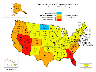
This map shows a lot of information in an uncluttered format. There is a title explaining what the map contains and a legend. The colors progress from blue for negative population change to red for highly positive population change. This is intuitive for rates at the opposite ends of the spectrum. The map is uncluttered and the rate of change data are categorized sensibly. No north arrow is needed as direction is easily assumed.

Lab 1 Part 2 Map Critique (Bad Map)

This is an example of a bad map. No orientation or north arrow. Also, no legend or scale so one does not know how far the housing complex is from the major roads. Typical of real estate sales maps. They are usually vague with no scale so that potential buyers are not discouraged by distance before inspecting the property

Monday, January 12, 2009

Test post